- 5월 24, 2013
- 게시자:: 외환 위키 팀
- 범주: 외환 트레이딩 시스템
Understanding the chart
This is an article I wrote some time ago:
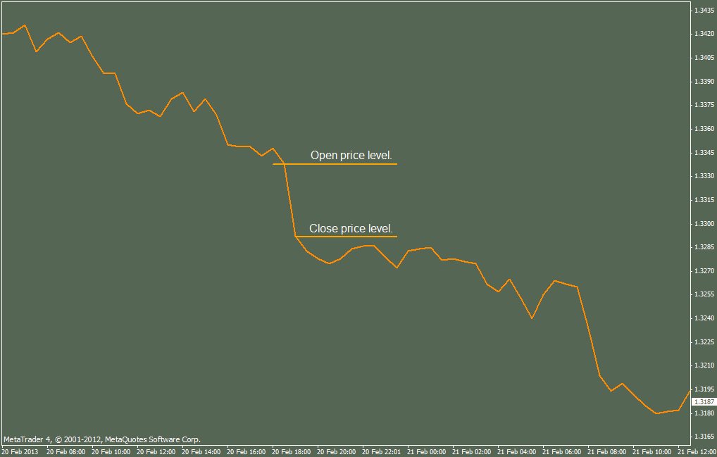
그만큼 차트 is a set of data containing information about 가격 행동 presented in a certain graphic form, 에이 visual form. The chart is the history of price action written in a specific picture alphabet – Candle alphabet, Bar alphabet 또는 Linear alphabet. Data containing information about price levels is sent by the broker’s server in information packs called ticks, and drawn by a computer programme as an element of the chart. 그만큼 linear chart contains the least information about price action, because it is presented as a linear set of averaged price levels starting at the Open value and ending at the Close value of a given period of time (기간).

그만큼 linear chart shows the trend pretty well, 하지만, it does not show any other information, especially, we can ~ 아니다 see the High 그리고 Low price levels in the given 기간, and it is difficult to recognize the beginning and end of each time period, thus, we cannot see the price action in this period of time. We can only see the average run of the price ~에서 그만큼 Open price, 에게 그만큼 Close price.
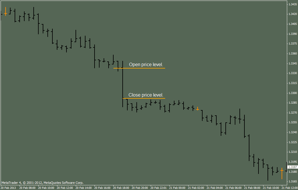
그만큼 Bar chart and the Candle chart contain the full information about OHLC 레벨.


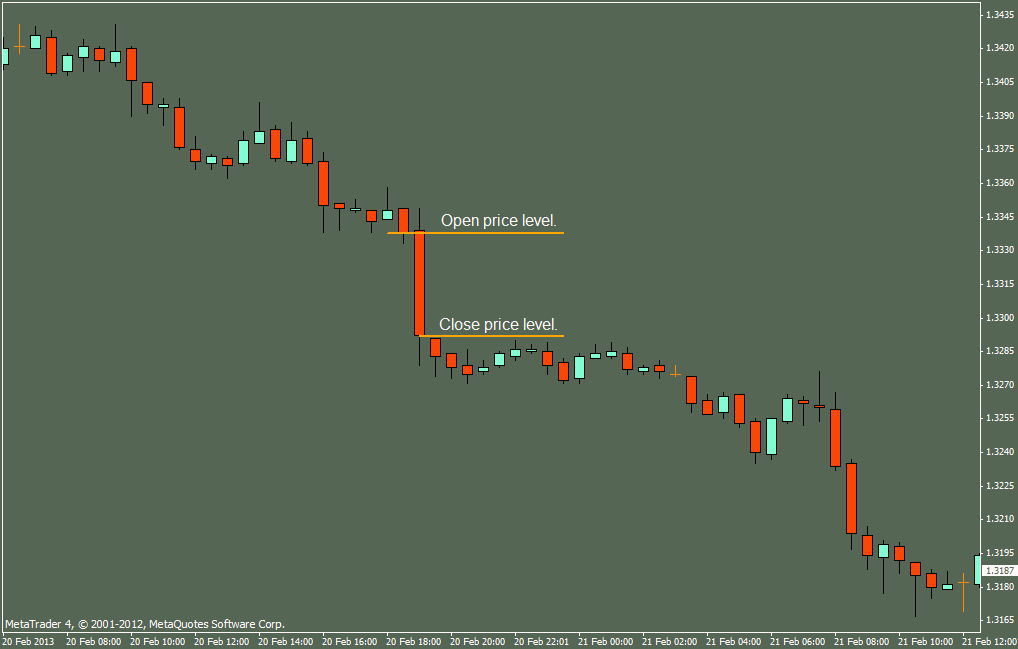
그만큼 Candle chart provides a much more visualy clear picture of price action in a given Timeframe. As we can clearly see, 에이 Candle consists of three areas: the candle body (from Open to Close), the upper shadow, the lower shadow. From the structure of the candle, we read the Open price level, 그만큼 High price level, 그만큼 Low price level and the Close price level. 다시 말해서, we can see what the price was doing in the given Timeframe. We do not need to read the actual OHLC values, it is enough that we can see, 저것:
Ø At such and such hour, the price tested a higher level, but found some Resistance (High) and began falling (upper shadow).
Ø The price fell down to a certain level and found some 지원하다 (Low), and there it stopped falling further.
Ø The price turned back upwards somewhat and Closed at a lower level than the previous Candle (lower shadow).
Ø 따라서, the trend in this period of time was Bearish.
In the exact same way, we can read each Candle, on every or any 기간 차트.
Reading each Candle, one by one, we get the whole story, the history of the price. We see the price action. We are able to read the chart. All other indicators, suddenly, become useless, because we can read the chart itself, and we can see it all. Indicators which, in theory, are supposed to show trend, take their data directly from the charts, not from another source. Since we can, now, see it for ourselves on the chart, what do we need any indicators for?
Ø In the following hour, the price dropped some more, created a new Low 수준, 그리고 Closed lower than the preceding Candle, thus confirming the Bearish trend.
Ø In the hour after that, the price still dropped, created a new Low 수준, 그리고 Closed lower than the preceding Candle. 하지만, we notice that the bodies of the last two Candles are much shorter than the body of the Candle we started with, so, obviously the trend is weaker, though still there.
Ø In the still next hour, the body of the Candle is even shorter and we can see the upper and lower shadows. 따라서, the price tested a lower level, found Support, tested a higher level, found Resistance, Closed lower than the preceding Candle, so the trend is still Bearish, but the price is, obviously, consolidating.
Let us take a look, again, at the Candle we startet out with.
그만큼 High price level is the Resistance level for that hour – isn’t it?
그만큼 Low price level is the 지원하다 level for that hour – isn’t it?
따라서, what are the shadow areas of Candles, if not Resistance and Support Zones for the given period of time?

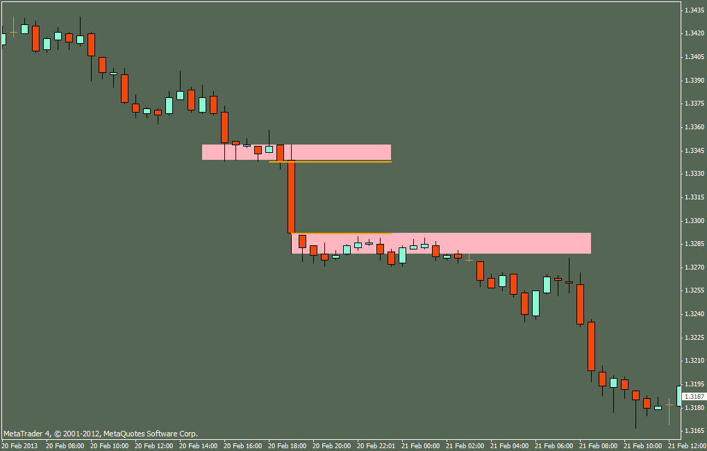
Following this trail, Resistance and Support Zones for a given Candle are nothing other than 가격 Consolidation Zones (equilibrium or balance of Buyers 그리고 Sellers) in a smaller period of time. There were still Buyers at the Open price, so the price went 위로. There were no more Buyers at the High price, 그리고 Sellers took over, so the price went 아래에. There were no more Sellers at the Low price, and the price started to go up again. The price went up until the Close 수준, 어디, again, the Sellers took over. With the help of a simple MT4 tool, the rectangle, we can draw such Zones, and we see even more clearly what is going on, 여기!
We cannot see that on the linear chart. We can, on the Bar chart, but not as clearly.
Continuation in next post due to picture limitation per post.
All of my indicator-tools have been designed in order to assist the Forex Trader in the process of learning Price Action and
the Supply/Demand Trading concept on demo accounts.
Any other usage of these indicator-tools is solely at the risk and responsibility of the individual Trader.
As with any tool, the proper usage depends on proper training and experience.
Any tool can be used in the occasional amateur style, the proffesional skilled craftsmen style, or the artists style!
And, as with any other tool, it can be missused, as well.
It is the investor/trader who makes the final decisions and judges or diagnoses the potential,
and it is the investor who is the amateur, the proffesional skilled craftsman, or the artist!
Just like the manufacturers of the simple hammer can not take responsibility for the effects or damages
arrising from using their simple tool, the creator of the tools presented herein can not take any responsibility,
whatsoever, for the effects or damages arrising directly or indirectly from using theForex Trade Supporting tools.
Loss or Profit in Forex Trading is the sole responsibility and sole risk of the investor/trader, and has nothing to do,
whatsoever, with any available tool, indicator or other computer programme.
There are a number of different factors, other than the tools themselves, which lead to success or failure in any trade,
including Forex Trading. It is extremely important to understand, that it is the investor’s ability to make the right decisions
at the right moments which lead to success, and the tools, no matter how fantastic, are only the Supportive Aid,
and not the decisive factor.
It is strongly advisable to thoroughly learn Price Action in Day Trading by Dadas as explained in this thread,
before applying the tools to your charts and trying to use the concept.
Attached, some helping tools.


